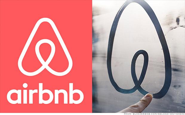
We know that Airbnb has been used for pop-up brothels, but it looks like they may be embracing a bit too much scandalousness. Behold, the new Airbnb logo: 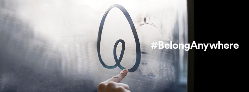
We're confused—is this testicles, a vagina, butt, boobs . . . or a tulip? We're not the only ones scratching our heads; Twitter is blowing up with immature snickering. Our favorite? This chestnut:
The AirBNB logo is a Rorschach test for which type of genitalia you're currently thinking about.
— Joel Bernstein (@CastIrony) July 16, 2014
Well said, sir. Now that we're done giggling like first graders, we'd like to remind you that this logo isn't the first to get tongues wagging. Here are some other scandalous designs we love. Feel free to snicker away.
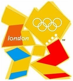
1. 2012 London Olympics Logo
Let's take a minute to remember the design that honestly looked like dear little Lisa Simpson giving head. To be fair, 2012 marked Lisa's 31st birthday, and hey—little girls grow up.
The original logo: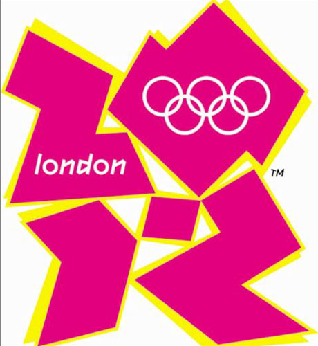
Which the Internet turned it into this:
2. A-Style
This Italian clothing company claims it meant to create a stir with its inappropriate looking logo. The company started humbly, with a dotted "A" logo. Then it added a bright yellow image of two stick figures doin' it doggie style. That's one way to get people's attention!
3. Locum
Oh, Sweden. We thank you for Ikea and Girl With the Dragon Tattoo, but your property management company's logo could use some—ahem—consideration. Behold, Locum's old logo. Though it has since been changed, some things can't be unseen. You know, things like company logos that read "I heart cum." 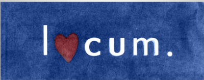
4. Office of Government Commerce
London again! You dirty minded blokes, you. Despite the fact that, when turned 90 degrees, the logo looks like a masturbating snowman—a spokesperson said (back in 2008) that the company was sticking with it. Or sticking it in . . .?
In any case, it hasn't changed. 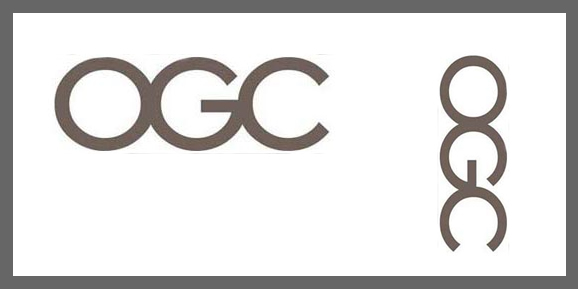
Alright. Now some other company needs to top these. Who's up?
Image: Behold, Airbnb's scarlet A. Courtesy of, Facebook


